Monday, 15 October 2012
Monday, 8 October 2012
Wednesday, 3 October 2012
Peer Review - des.
Team des. had continued to develop there design philosophy (mentioned in their earlier review) about how there is no set definition to just 'What is a Utopia? What is Dystopia? Their presented models and diagrams showed a continuity in their design process; a development from the previous workshops, but there intentions and ideas were not conveyed thoroughly during the review process.
Their design concept was to create an environment to which a visitor or guest to their individual hotels, could experience something new, something different, something unique every time. des. stated that their is an incorporation of elements that create a juxtaposition between the thematic scheme and the physical form of the hotel designs: where the Utopian themed hotel would incorporate their dystopian-style plant room and vice-versa.
The group, in their final workshop, became faced with the concept of "realism"; to create a design that was both imaginative and practical. The team challenged this idea of "realism" by focusing mainly on the physical layout of their individual hotel elements; the stairs and the plant room. Their decision was to take the plant room design as the focal point for the city-based hotel, the main entrance, underground, into the hotel. By experiencing the atmosphere created by the plant room area initially, a guests interpretation of the interior design would greatly influence what message they take away from the exterior (facade). Their plant room models of MDF and Perspex with string intertwined and tangled string conveyed a more chaotic sensibility, to further this juxtaposition between elements. An additional model was created using Rhino. A 3D model detailing a plant room that was imagined to be made from a light-transmitting material. This acceptance of light plays a significant role in the design concept of this second plant room. The use of light, the emphasis on openness and the representation of a physical form that closely resembles a type of tensile structure, are atmospheric qualities usually associated with the concept of a utopia; of a land indicative of freedom and light.
Team des.'s design concept has not changed much over the course of the final two workshops since their previous review. Instead there has been a greater focus on developing their design ideas further to better convey both spatial sensibilities; utopia and dystopia. Their design has been focused primarily around the concept of creating an overall juxtaposition, not only between the two hotels but between each of the hotels individual interiors and exteriors. Though Team des. was not able to complete their presentation due to some of their presentation elements being incomplete, they managed to provide a sufficient discussion of their design philosophy.
Tuesday, 2 October 2012
Monday, 1 October 2012
Sunday, 30 September 2012
Tuesday, 25 September 2012
Our design philosophy
A/L/D
Our philosophy is clear. To create an environment where one can interpret the built environment in their own way; interpret it as their own utopia or dystopia. Our hotel designs are a representation of this design concept. By creating a unique environment within each hotel and from each hotel's structural design, we have created a conjunction of juxtaposing concepts and ideas. The hotel based on Waiheke island incorporates this idea of disintegration and degradation, which is a quality associated with a more chaotic, dystopic sensibility. To create a counterbalance with this dystopic feature through the docking pods stationed at sea. The concept was to have these evolve with with environment; grow barnacles, seaweed, coral and unify itself with the natural environment. These docking stations become a kind of transition through this journey between hotels. The city-based hotel takes on a more fluid and sinuous form; a direct contrast with the hotel on Waiheke, and this irregularity and asymmetry can often be viewed as a more chaotic sensibility.
Both designs are in almost complete contrast with each other, but in this contrast, a juxtaposition of ideas is created which obscures any fixed belief that either hotel is based solely on one conceptualized idea.
Both designs are in almost complete contrast with each other, but in this contrast, a juxtaposition of ideas is created which obscures any fixed belief that either hotel is based solely on one conceptualized idea.
Monday, 24 September 2012
Wednesday, 19 September 2012
50 x 50 pixel Image
Image used in our first workshop - We are attempting to recreate this threshold image through knitting.
Monday, 17 September 2012
Peer Review - Unite
Team Unite had drawn on the experience and knowledge of previous design workshops to create two distinct hotel designs and hotel facade elements. They felt that to convey this idea of a Utopia-like atmosphere, their design should emphasize a feeling of freedom and an in-flight sensibility and then juxtapose this idea with a deepening sense of of claustrophobia and entrapment.
These ideas were then given structural form and presented in Secondlife to convey their philosophy.
Their Hotel facade design for Waiheke Island incorporated very organic, sinuous forms that rise up into the air to highlight verticality and the idea of flight and freedom, through these seemingly free-form elements. Unite's primary goal for this design was to create an environment in which this hotel could be related to a utopia and used to create, and to showcase, "new experiences" for the visitor. To further express this overall sense of freedom and openness, the design remains an open structure. This spatial treatment expresses the theme and atmosphere of what an expected utopian setting would be.
For the city, Unite felt that in order to properly contrast a utopia-like design and feel from that of a dystopic one, the design of the building facade should be juxtaposed in quite an obviously relevant way. The design incorporates shards of moving earth protruding from the ground in a very chaotic and cataclysmic like display. To contrast the idea of freedom and spaciousness, the entry into the design integrates a very low ceiling design element to emphasize claustrophobia and the sense being trapped within a space and have an uneasy feeling about the cavernous like atmosphere, with an almost fragmented-like application to the design process of the shattered earth.
Team Unite also presented a short discovery movie of their two designs that very much placed it within this almost, fantasy-like setting and atmosphere and it created it helped to convey that sense of having a new experience when visiting these two hotel designs and being able to read their philosophy and their place of architectural design.
Sunday, 16 September 2012
Saturday, 15 September 2012
A/L/D The design so far...
A/L/D Architecture
Throughout the design process of the two hotels we have focused primarily on conveying one simple aspect, the interpretation of just what a Utopia/Dystopis is. Our goal was to create a unique environment in both hotels to which visitors can come and visit and stay and could interpret their experience of the hotel in their own way and interpret their own Utopia or Dystopia.
Much of the design was inspired by natural elements, organic and fluid elements that becomes a way of explaining our design concept. The docking platforms stationed out at sea for the lantern vehicle (as per design) emphasize a sculptural aesthetic but are designed to evolve with environment around it. The concept was that coral and barnacles, for example, could attach themselves to the exterior of the docking station, grow on it, grow around it and, essentially become apart of it to express the relationship between modern architecture and the environment itself. It is the juxtaposition of both utopic and dystopic elements. The concept was that the docking pad could also be used as a site seeing platform and that the lantern's pod or gondola could attch to some of these stations and detach from the envelope to descend to ground level.
The docking station located within the hotel based in the city reflects the fluidity of the hotels overall form and shape. The flying fox based gondola design is a free falling vehicle and so needs to be able to decelerate by design. The wire begins with a very steep angle to create increased acceleration and then a gradually ascending slope to cause deceleration. The sloping wire is more than a functional element it helps to reflect the organic nature of the building. For Waiheke island its docking area is a cavernous space inside the landscape which expresses this idea of disintegration and degradation emphasized by the staircase design in the Waiheke hotel reception building.
The design of each hotel is reflected in its individual elements; the staircase, landing pads, docking stations etc. and help to create a juxtaposition between a utopia and a dystopia themed environment.
Monday, 10 September 2012
Sunday, 9 September 2012
Friday, 7 September 2012
Tuesday, 28 August 2012
Lantern - Stiffening development
Through this workshop we have experimented with a number of different materials (such as wire and starch) in an attempt to stiffen the bottom portion of the tissue lantern.
Through this process we have concluded with applying an iron on stiffening used in sewing. This application enables us to form a stiff lower portion to our lantern and is relatively light weight.
Saturday, 25 August 2012
Wednesday, 22 August 2012
Monday, 20 August 2012
Peer Review - Des.
Team Des. were tasked with creating a means of transportation between their two hotel designs on Waiheke Island and in Auckland city that incorporated a renewable and non-renewable energy source of some kind. The idea was to create a means by which occupants could fly over from one point to another (one hotel port to another) and one non-flying transport that would achieve the same intended goal. With their vehicles designs, Team Des. looked into the application of a port area into the overall structure of the design of their hotel on both sites.
The team had shown extensive research into various design concepts and how they related to their own design ideas and the idea that neither vehicle conveyed a set definition as to what a utopia or dystopia is but rather that that is all dependent on how the occupants within the vehicles interpret it to be. This gives meaning to the reinvention of a design to convey both and yet neither the idea of a utopia and dystopia-like atmosphere.
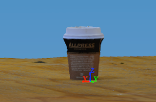
The team also used 123D Catch to create 3D versions of a hair brush and a coffee cup as starting points for the development towards ports incorporated into their hotel designs. To further develop their ideas for a hotel development, the team sought to capture 'movement' in the form of a short animation/movie to show this movement within nature, for example the movement of leaves in the wind etc.
After the first stages of development, the team came about using a different medium to explore their ideas than the coffee cup used in their 3D creation; a plastic bottle. Des. explored the idea of deformation, melting and deforming the bottle to create a more abstract and significantly more interesting form. This lead to the discovery that when the bottle was melted it created a highly abstract form from the exterior and a simpler, cleaner, sinuous form from the interior.
The team created and two vehicles and explored the different variables of weight, weight distribution and size of materials etc, and recorded the many experimental trials, seeking to improve the design at every stage. The first design trial was a plastic bottle that was filled with an air and alcoholic vapour combination that when ignited creates an instantaneous burst of energy that leads to an immediate forward thrust ( an immediate propulsion system ) that acted as a non-renewable fuel source for the transport design. The second transport design was a simple flying lantern that involved the same design principles as a hot air balloon (the heating of air to create a dense rise of steam that with convection lifts the balloon into the air). Team Des. also designed a third vehicle. Their mock up test model was created using a plastic cup with plastic straws inserted into the bottom that is placed on top of a plastic plate. when the cup is filled with water it then rushes out from the straws, seeps beneath the plate and creates forward momentum to move the vehicle.
The team become interested in the idea that their hotel could be a very elaborate and abstract form that was buried underground as a means to convey an interesting aesthetic. There basis was to create a form from which the occupants can interpret the ideas of a utopia / dystopia like environment in their own way. Team Des. presented a large amount of work, research and development that detailed their vehicle designs and their hotel form and structure. The overall presentation was well prepared and themes were well conveyed in a fairly professional manner that was easy to understand.
Staircase Design - Auckland City Hotel
This design view shows a vertical cut section of a staircase element and shows how people are able to travel simply from one floor to another;
then a horizontal cut section to convey the multi-functionality of the staircase design as more than a means of moving through space but as a means of providing a place to sit and rest. This view also helps to convey the overall form of the design as well as this idea of an organic, flowing element within a more geometrically based hotel design.
Subscribe to:
Posts (Atom)


